Website updates in progress.
This case study is actively being worked on.
Please email with any questions.
This case study is actively being worked on.
This case study is actively being worked on.
Website updates in progress.
This case study is actively being worked on.
Please email with any questions.
This case study is actively being worked on.
Please email with any questions.
Website updates in progress.
This case study is actively being worked on.
Please email with any questions.
Website updates in progress.
This case study is actively being worked on.
Please email with any questions.
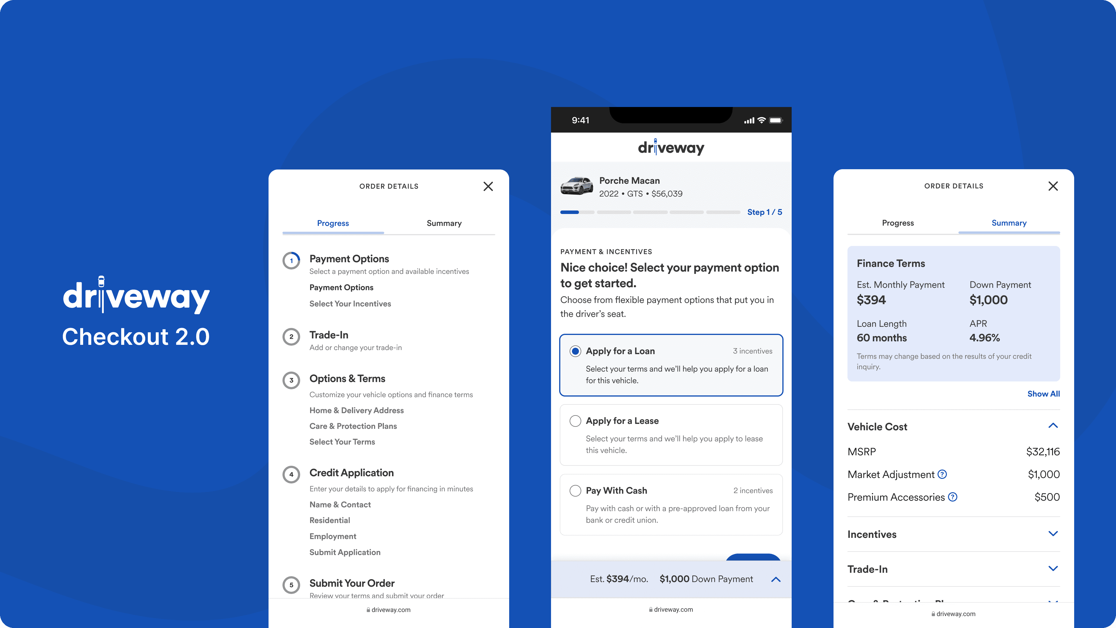
Driveway’s checkout had fallen out of sync with the product. Customer satisfaction was low, and conversions weren’t meeting expectations. I led a full redesign to streamline and optimize this critical experience.
Role
Principle Product Designer
Contributions
Strategy
UX Design
UX Design
UX Design
UX Design
UX Design
UX Design
UX Design
UI Design
UX Research
Prototypes
Design System


Role
Role
Role
Principal Designer
Principal Designer
Principal Designer
Contributions
Contributions
Contributions
Concepting
Concepting
Concepting
Prototyping
Prototyping
Prototyping
Design
Design
Design
Strategy
Strategy
Strategy
User Research
User Research
User Research
Usability Testing
Usability Testing
Usability Testing
Context
Driveway is a startup owned by Lithia Motors (NYSE: LAD), the largest new-car retailer in the US. During my time at Driveway I worked on redesigning the end-to-end customer shopping experience.While this project was named Checkout 2.0, this is not your typical "1-2-3 checkout". Buying a vehicle online involves many facets. The experience needed to accommodate unique flows for pre-owned and new cars, loan pre-qualification, financing, leasing, customer trade-ins, and home delivery scheduling.


Research
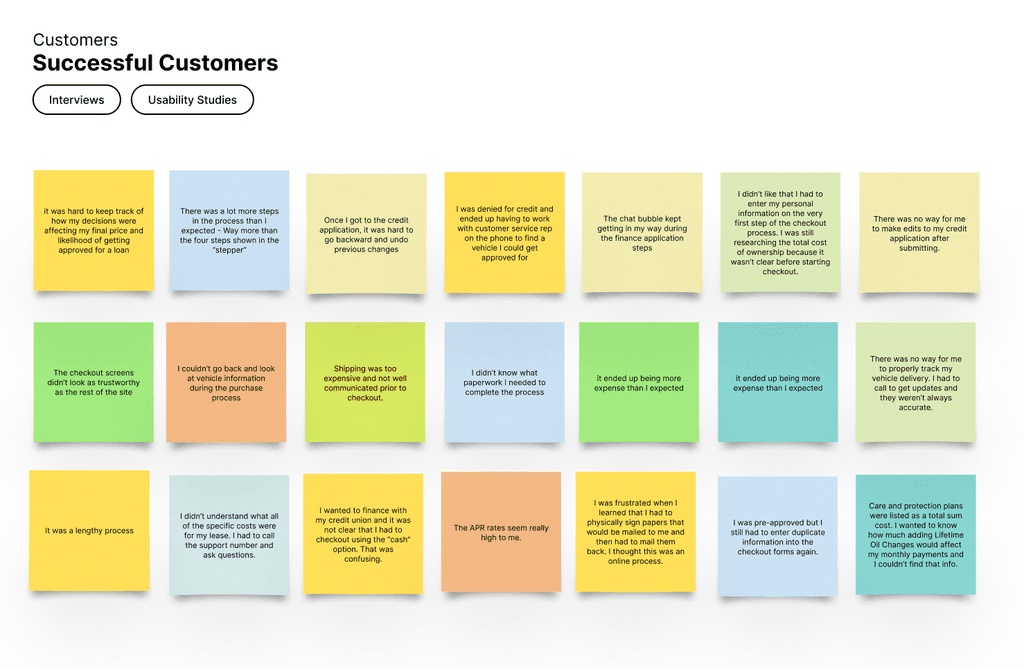
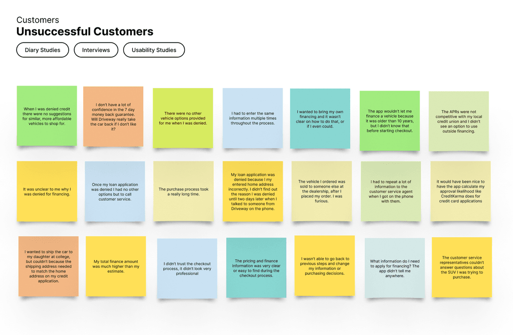
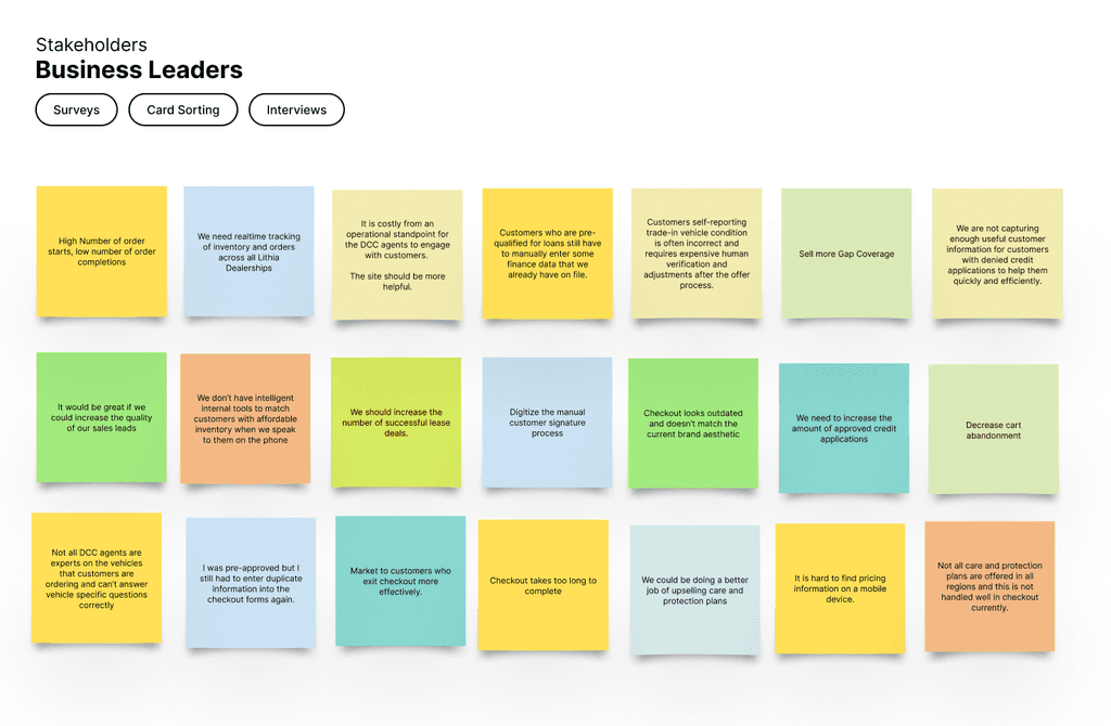
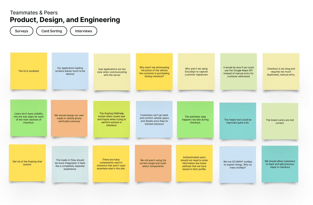
I worked on gathering existing research data as well as gathering fresh feedback from users, business stakeholders and cross functional teammates through various research activities such as interviews, usability testing, diary studies, and card sorting exercises.
Research
I worked on gathering existing research data as well as gathering fresh feedback from users, business stakeholders and cross functional teammates through various research activities such as interviews, usability testing, diary studies, and card sorting exercises.
Research
I worked on gathering existing research data as well as gathering fresh feedback from users, business stakeholders and cross functional teammates through various research activities such as interviews, usability testing, diary studies, and card sorting exercises.
Research
I worked on gathering existing research data as well as gathering fresh feedback from users, business stakeholders and cross functional teammates through various research activities such as interviews, usability testing, diary studies, and card sorting exercises.
Research
I worked on gathering existing research data as well as gathering fresh feedback from users, business stakeholders and cross functional teammates through various research activities such as interviews, usability testing, diary studies, and card sorting exercises.
Research
I worked on gathering existing research data as well as gathering fresh feedback from users, business stakeholders and cross functional teammates through various research activities such as interviews, usability testing, diary studies, and card sorting exercises.
Research
I worked on gathering existing research data as well as gathering fresh feedback from users, business stakeholders and cross functional teammates through various research activities such as interviews, usability testing, diary studies, and card sorting exercises.








Problems to Solve
After synthesizing and consolidating all of the feedback from interviews and research exercises the following priorities were aligned on.
Problems to Solve
After synthesizing and consolidating all of the feedback from interviews and research exercises the following priorities were aligned on.
Problems to Solve
After synthesizing and consolidating all of the feedback from interviews and research exercises the following priorities were aligned on.
Problems to Solve
After synthesizing and consolidating all of the feedback from interviews and research exercises the following priorities were aligned on.
Problems to Solve
After synthesizing and consolidating all of the feedback from interviews and research exercises the following priorities were aligned on.
Problems to Solve
After synthesizing and consolidating all of the feedback from interviews and research exercises the following priorities were aligned on.
Problems to Solve
After synthesizing and consolidating all of the feedback from interviews and research exercises the following priorities were aligned on.
Improve user experience
Reduce the number of screens, improve navigation and wayfinding, optimize for customer feedback, improve hierarchy and appearance.
Increase price transparency
Surface price information more clearly, improve the finance estimator, communicate in-the-moment decisions and their affect on affordability.
Give customers more control
Provide a better self-servicing experience and surface more options. Improve dead-ends for customers with declined credit applications.
Objectives & key results
Some of the objective and key results that we aligned on as a team for the redesign.
Objectives & key results
Some of the objective and key results that we aligned on as a team for the redesign.
Objectives & key results
Some of the objective and key results that we aligned on as a team for the redesign.
Objectives & key results
Some of the objective and key results that we aligned on as a team for the redesign.
Objectives & key results
Some of the objective and key results that we aligned on as a team for the redesign.
Objectives & key results
Some of the objective and key results that we aligned on as a team for the redesign.
Objectives & key results
Some of the objective and key results that we aligned on as a team for the redesign.
90%
Improve customer satisfaction
Achieve a customer satisfaction score (CSAT) of at least 90% for customer post-support surveys.
6 less
Reduce total number of steps
Decrease number of steps for a completed vehicle order, trade-in, and finance application by six screens.
20%
Reduce time to complete
Decrease the average time to complete a successful order with a finance applications by 20%.
10%
Reduce support calls
Decrease the calls to customer care and order resolution teams by 10% across all checkout 2.0 control groups.
15%
Decrease customer cart abandonment
Decrease the amount of abandoned vehicle order sessions by 15% across all checkout 2.0 control groups.
8%
Increase approved credit applications
Increase the number of customers with completed finance applications with approval outcomes by 8%.




Improve User Experience
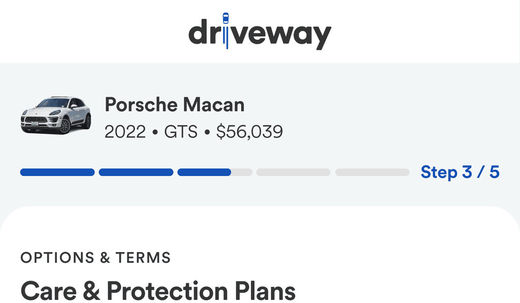
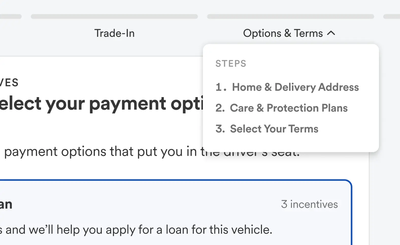
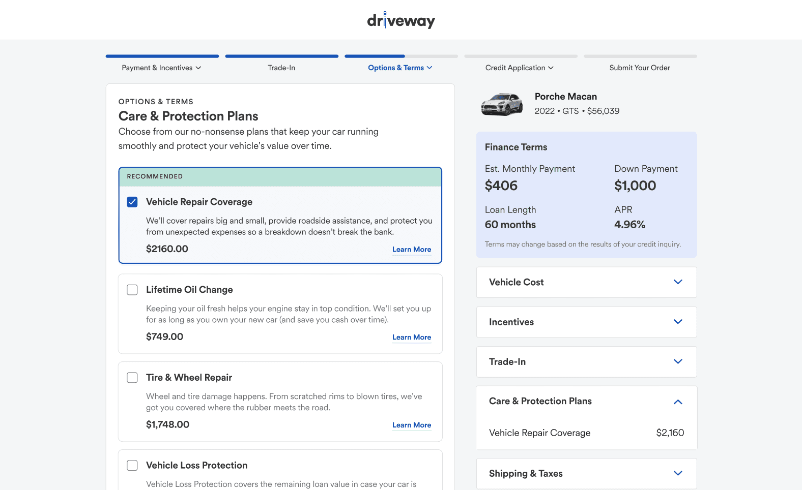
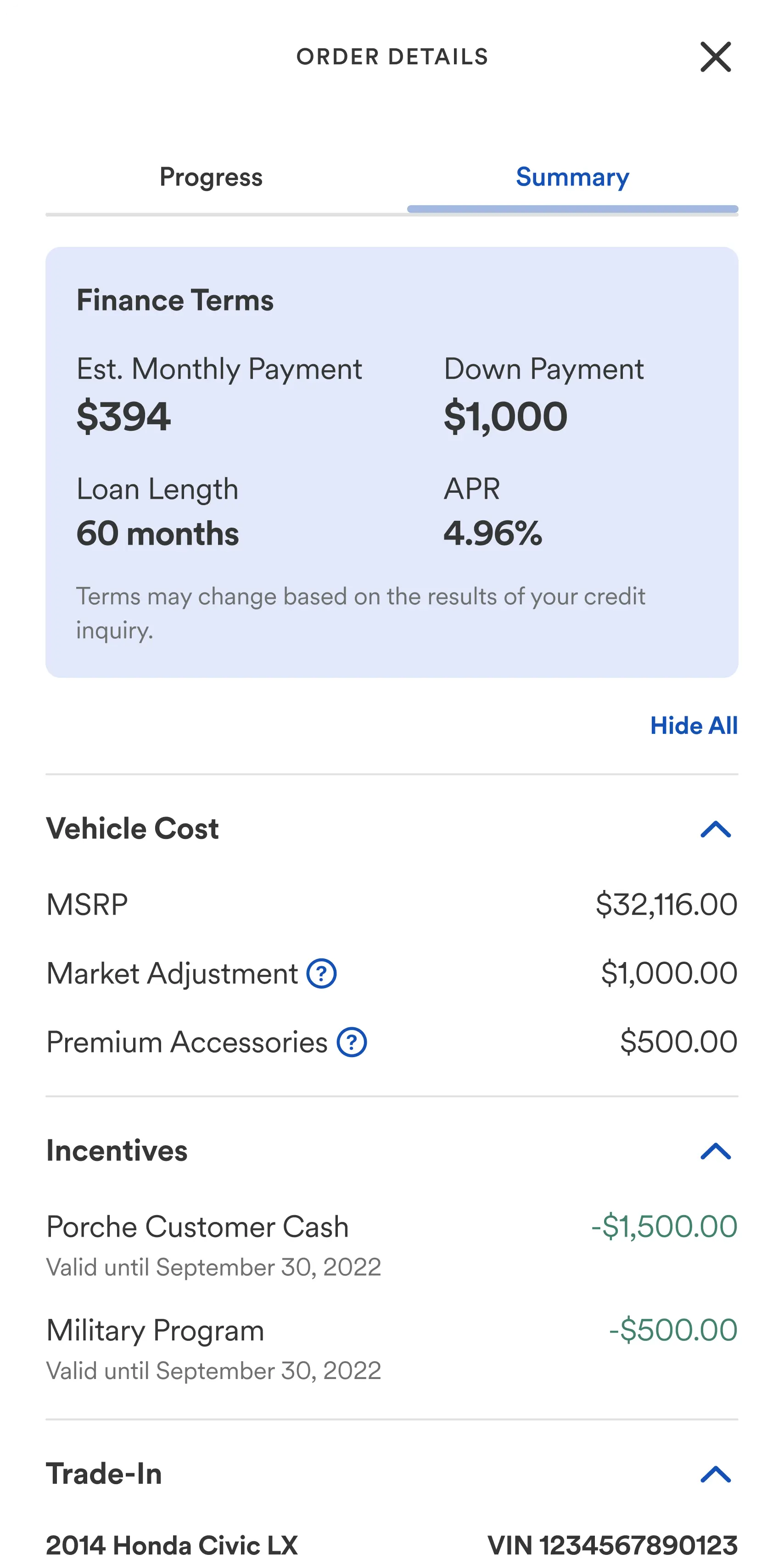
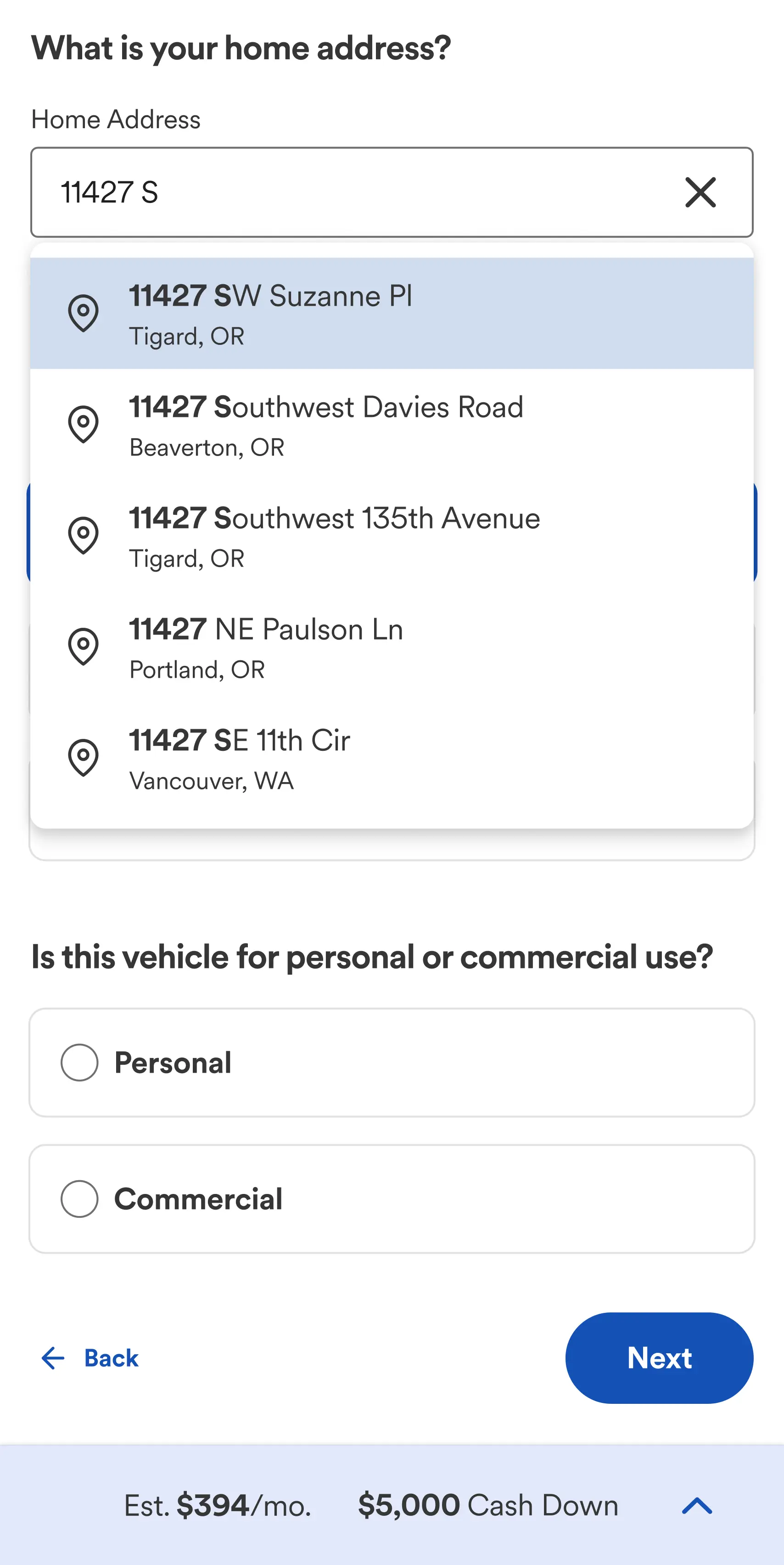
When talking to customers one of the biggest complaints, was it was unclear to them what was involved, and what they would need to successfully complete their order. Customers wanted to know the exact steps, the information they needed, and to approximate how long the process would take. To solve this, I introduced a new interaction pattern that combined two of the primary customer needs, Order Progress and Order Details.




Price Transparency
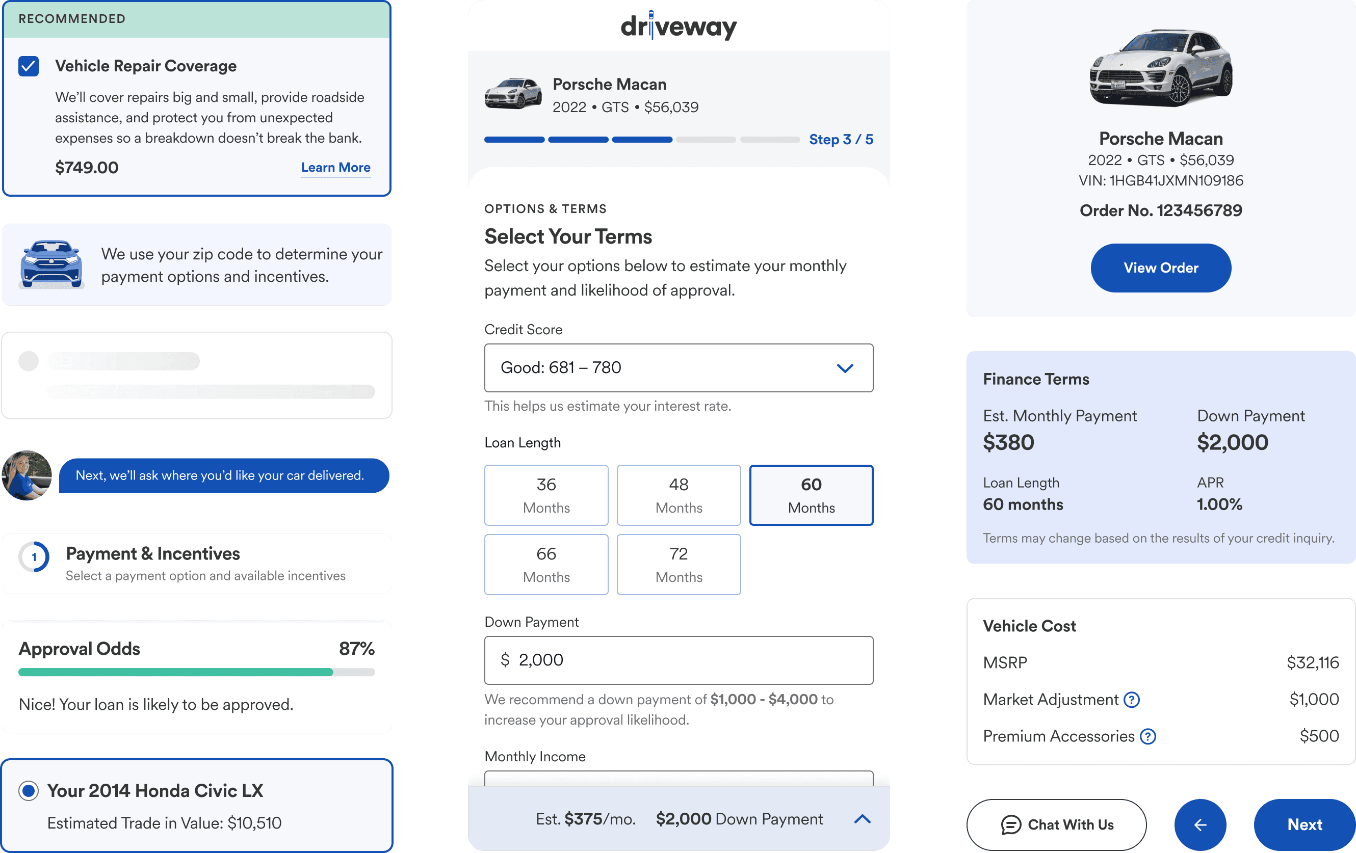
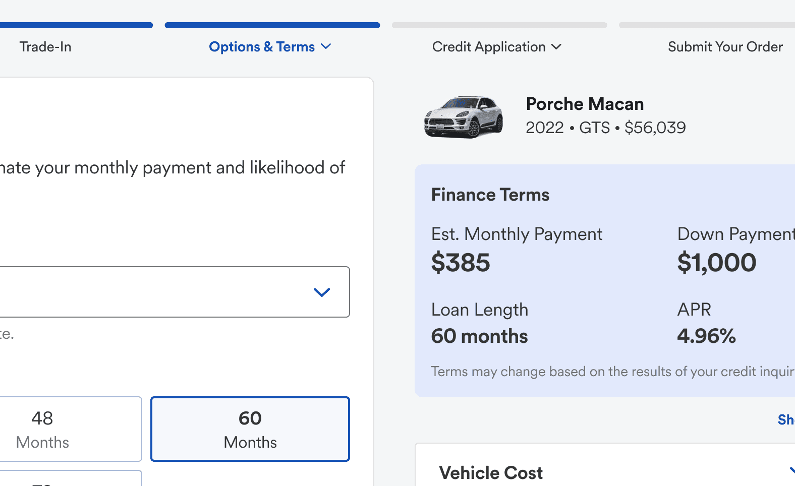
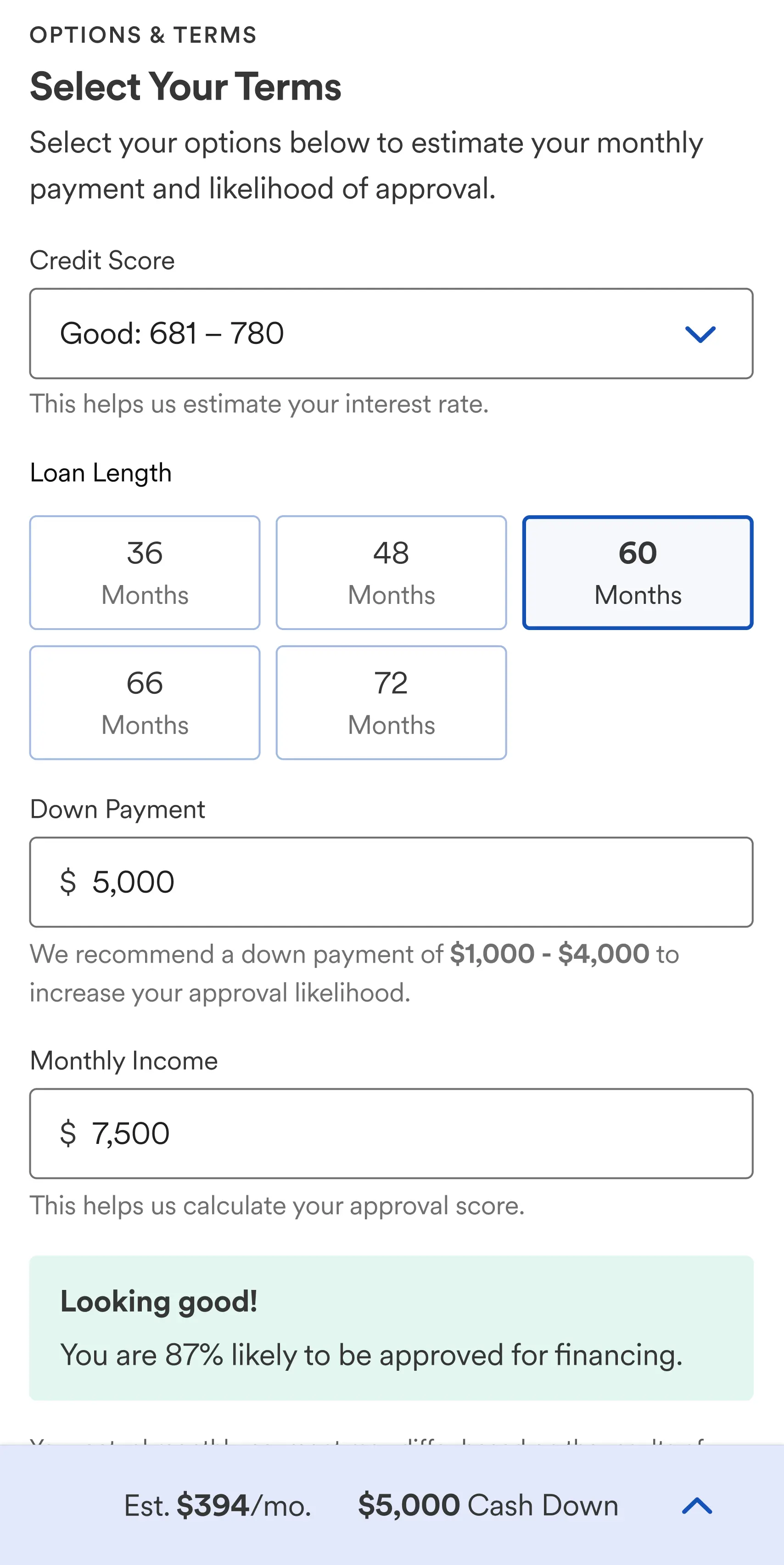
Improving price transparency throughout the experience was a top priority. When choices were made that impacted a customer’s total cost, monthly payment, APR, or overall affordability, those outcomes were clearly communicated within the UI. I ensured that estimated costs and finance information were visible on all screens throughout the experience, working with the team to identify the best mechanism to communicate the information clearly.






Want to Know More?
Book a call, request a case study, or ask me some questions.
Email Me
6 less
Reduce total number of steps
Decrease number of steps for a market assortment creation by six screens.
90%
Improve customer satisfaction
Achieve a customer satisfaction score (CSAT) of at least 90% for customer post-support surveys.
20%
Reduce time to complete
Decrease the average time to complete a cluster market analysis across six assortments by 20% or more.
Other Projects
“Most importantly, Derek is a joy to work with. No ego, just high quality work and a genuine care for others and the product.”

George Clingan
Experience Design Manager
Accepting work inquiries
“Most importantly, Derek is a joy to work with. No ego, just high quality work and a genuine care for others and the product.”

George Clingan
Experience Design Manager
Accepting work inquiries
“Most importantly, Derek is a joy to work with. No ego, just high quality work and a genuine care for others and the product.”

George Clingan
Experience Design Manager
Accepting work inquiries
“Most importantly, Derek is a joy to work with. No ego, just high quality work and a genuine care for others and the product.”

George Clingan
Experience Design Manager
Accepting work inquiries
“Most importantly, Derek is a joy to work with. No ego, just high quality work and a genuine care for others and the product.”

George Clingan
Experience Design Manager
Accepting work inquiries
“Most importantly, Derek is a joy to work with. No ego, just high quality work and a genuine care for others and the product.”

George Clingan
Experience Design Manager
Accepting work inquiries
“Most importantly, Derek is a joy to work with. No ego, just high quality work and a genuine care for others and the product.”

George Clingan
Experience Design Manager
Accepting work inquiries
Stay connected with email
Sign up to receive a few email updates a year from me.
Stay connected with email
Sign up to receive a few email updates a year from me.
Stay connected with email
Sign up to receive a few email updates a year from me.
Stay connected with email
Sign up to receive a few email updates a year from me.
Stay connected with email
Sign up to receive a few email updates a year from me.
Stay connected with email
Sign up to receive a few email updates a year from me.
Stay connected with email
Sign up to receive a few email updates a year from me.
