Driveway’s vehicle order experience struggled to keep up with the needs of the growing business and wasn’t meeting customer expectations. I was asked to lead the redesign of this flagship experience for the product.
Role
Principal Product Designer
Contributions
Concepts
Prototypes
Design
Strategy
Usability Testing
Role
Principal Designer
Contributions
Concepting
Prototyping
Design
Strategy
User Research
Usability Testing
Context
Driveway is a startup owned by Lithia Motors (NYSE: LAD), the largest new-car retailer in the US. I joined Driveway when they launched in October 2020 to help achieve their goal of redefining how consumers buy, sell, and finance vehicles 100% online. This is one of the many projects I worked on while focusing on the revenue and consumer web app experience team.
While this project was internally named Checkout 2.0, this is not your typical "1-2-3 checkout". Buying a vehicle online involves many facets. The flow needed to accommodate pre-owned and new cars, pre-qualification, financing, leasing, credit applications, denied credit, customer trade-ins, and scheduling for home delivery.
Over the span of 2 years, additional steps and features had been added piece meal and a wholistic evaluation of the checkout experience was overdue. While the current flow checked all of the boxes for technical requirements, it wasn't meeting business conversation goals or customer expectations. I was asked to concept and design a re-imagined and improved checkout experience.

Problems to Solve
1. Denied credit applicants would find out they couldn’t afford a vehicle too late in the flow. This resulted in a high number of orders starts, but low order completions.
2. Key affordability information was often obfuscated and it wasn't always clear how decisions affected total cost and affordability.
3. Users reported that it was unclear to them how the online car buying process worked and struggled to understand what was involved in the process.
4. Sad paths required human intervention and didn’t provide helpful alternative options and more affordable inventory for customers in need.
Solutions Explored
1. Affordability focused interactions were moved as close to the beginning of the flow as possible to provide customers with a better understanding of approval likelihood.
2. Decisions that affected terms and total costs were clearly communicated in the moment, and an improved and persistent total cost summary UI was added.
3. An improved system of navigation and wayfinding that helped customers understand the breadth of the flow and enabled them to traverse more easily.
4. Sad paths such as denied finance applications were paired with appropriate in-app optionality that helped customers find alternate vehicles they could afford.
TL;DR: Results
At the time of putting this case study together, Checkout 2.0 has not fully been rolled out into production. However, I can share some before-and-after attitudinal analysis and other measurable insights from usability testing.
Shorter Workflow: Reduced the total number of steps required to complete the flow and lessened the average total time to complete a vehicle order with approved financing.
Improved Navigation and Wayfinding: Usability subjects reported an 18% increase in attitudinal analysis with comparing the ease of navigation and completing the flow. Comparing current Checkout: 68% → Checkout 2.0: 86%
Improved Price Transparency and Customer Trust: Usability subjects reported a 23% increase in their ability to understand how their decisions affected finance terms and the total cost to finance as they moved through the flow. Subjects reported increased trust that prices were accurately represented through the process without any hidden fees.
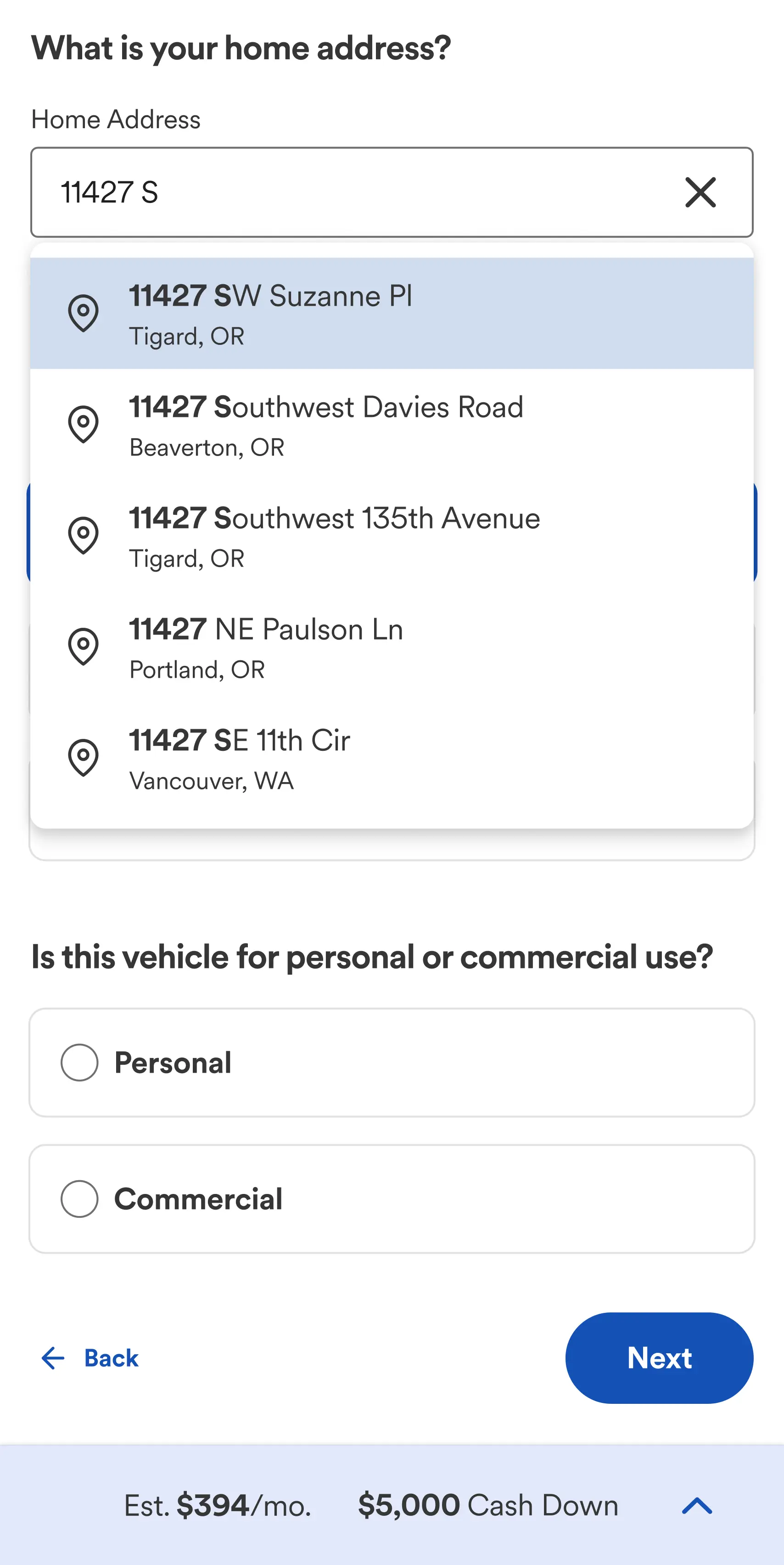
Improved UX and Reduced Customer Errors: By incorporating Google/USPS auto-complete for address entry, Checkout 2.0 was able to almost entirely eliminate customer error when entering home address information. Which would decrease the time customer support agents spend working with customers to correct information.

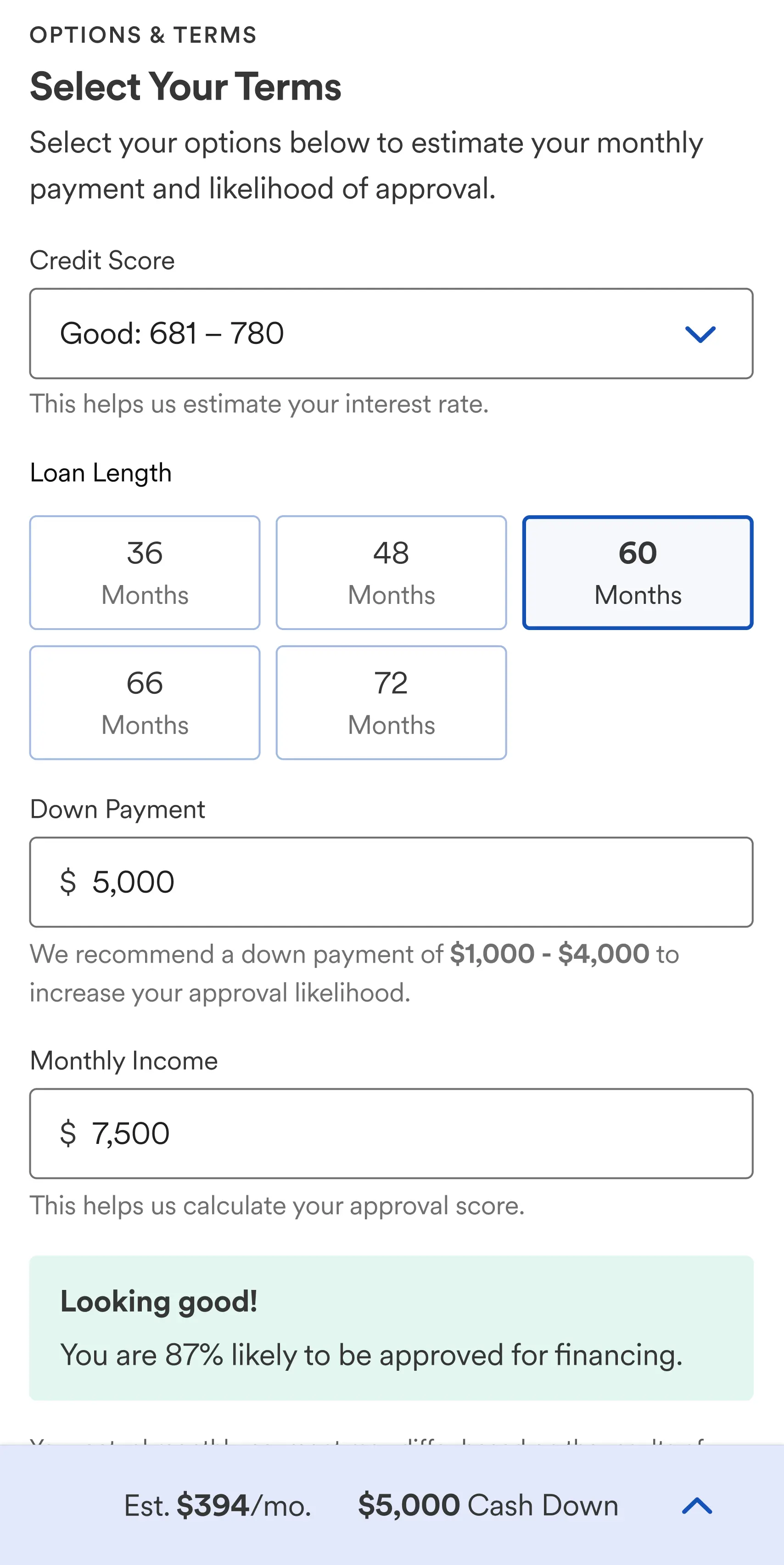
A simplified example of re-prioritizing the finance estimator within the flow
One of the Challenges
While looking for ways to improve the customer experience and increase conversions, we focused on the finance estimator feature.
Our research uncovered a valuable insight: the sooner customers engaged with the finance estimator, the more likely they were to complete the flow with an approved loan.
Initially, the estimator was positioned towards the end of the process. This decision was influenced by the multitude of factors affecting the total finance amount, including trade-ins, additional care and protection plans, and incentives. The original intention was to enhance the accuracy of the estimator by positing all of the customer inputs that impacted the total finance amount before the estimator.
Upon closer examination of the data, we unearthed a pivotal revelation: the single most influential factor in determining affordability was trade-in credit. The other inputs had comparatively minor impacts on approval likelihood. As a result, we maintained the trade-in credit's position in the flow before calculating approval likelihood, while the remaining cost-related interactions were strategically re-prioritized and relocated later in the flow.

Navigation and wayfinding
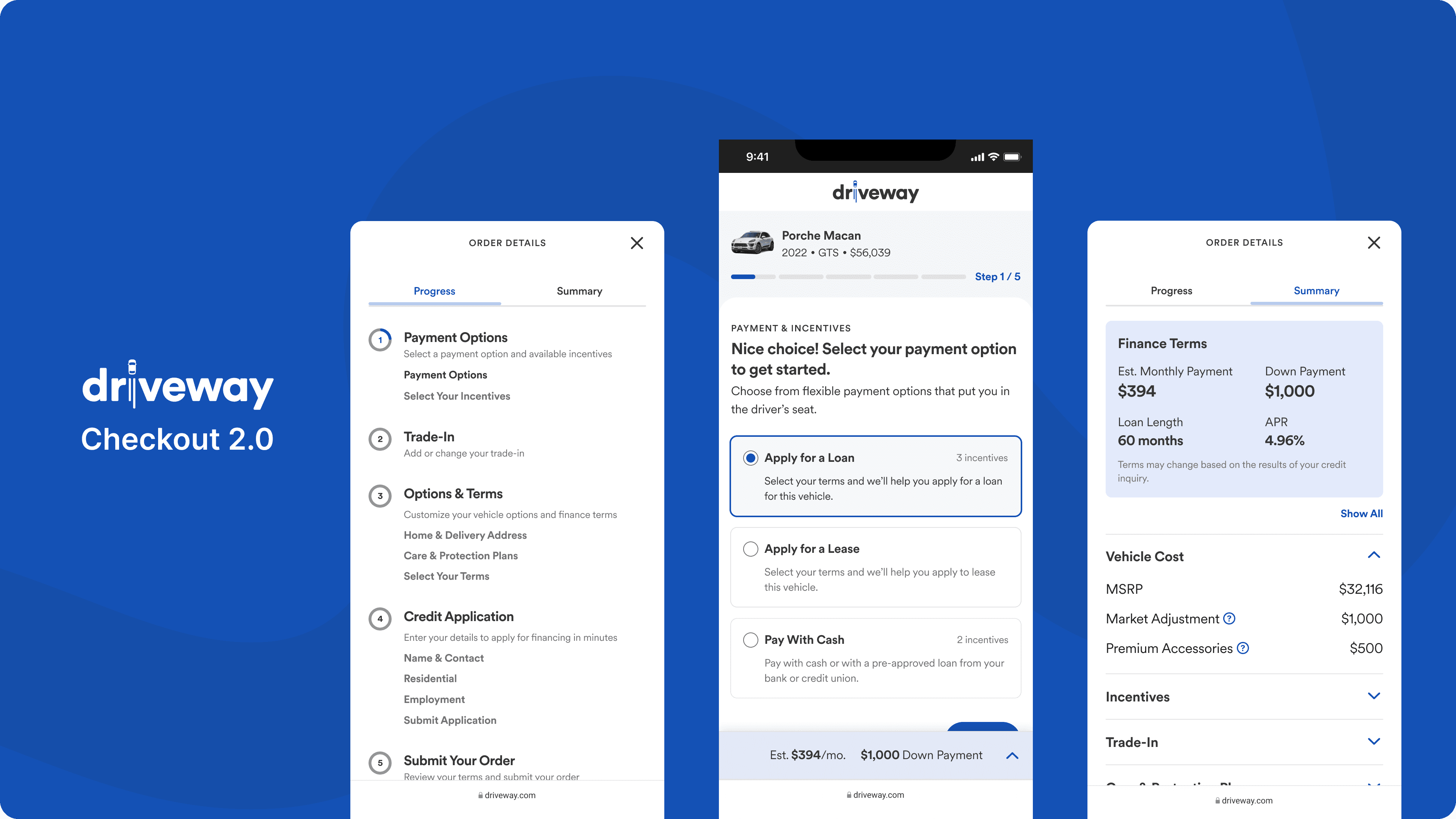
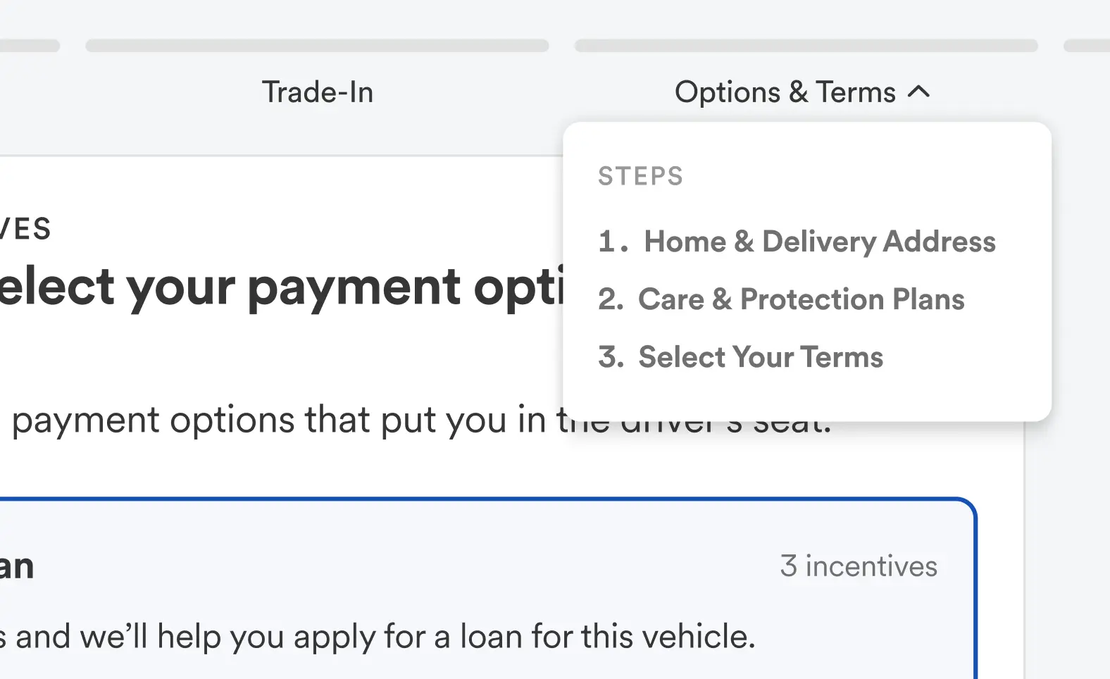
When talking to customers one of the biggest complaints, was it was unclear to them what was involved, and what they would need to successfully complete their order. Customers wanted to know the exact steps, the information they needed, and to approximate how long the process would take. To solve this, I introduced an incremental linear stepper design pattern that addressed several customer complaints:
Communicating the specific steps in the vehicle order process
Utilized the Goal Gradient Effect and improved the communication to users on their progress within each step
Provided visibility into the sub steps of each section
Empowering customers to traverse the checkout experience as needed
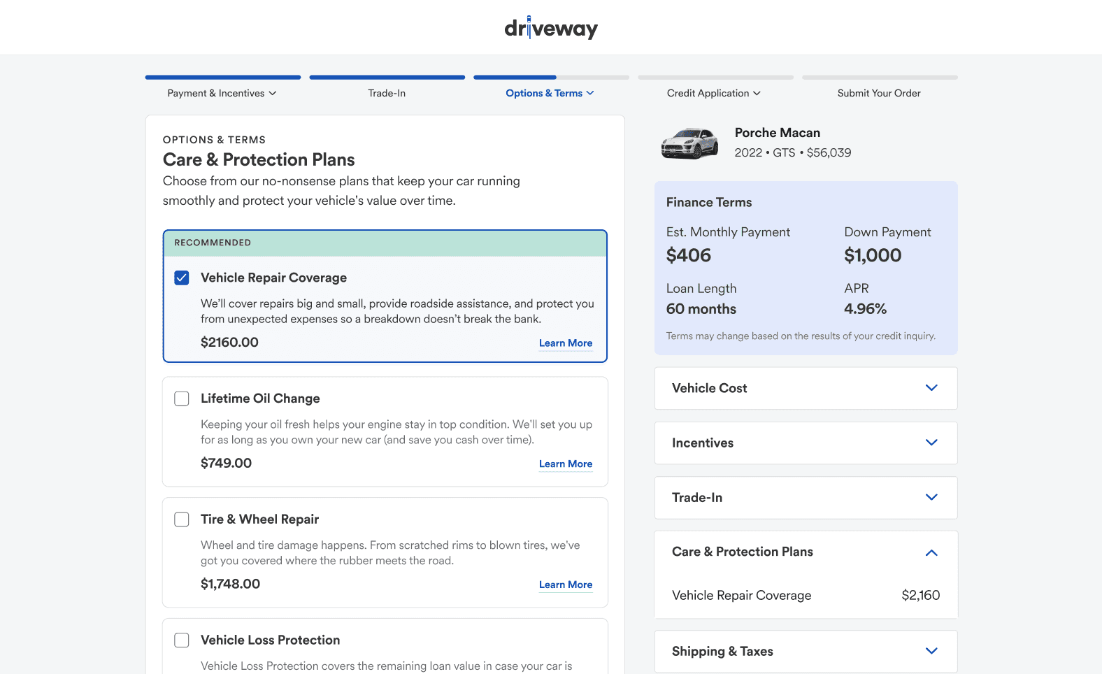
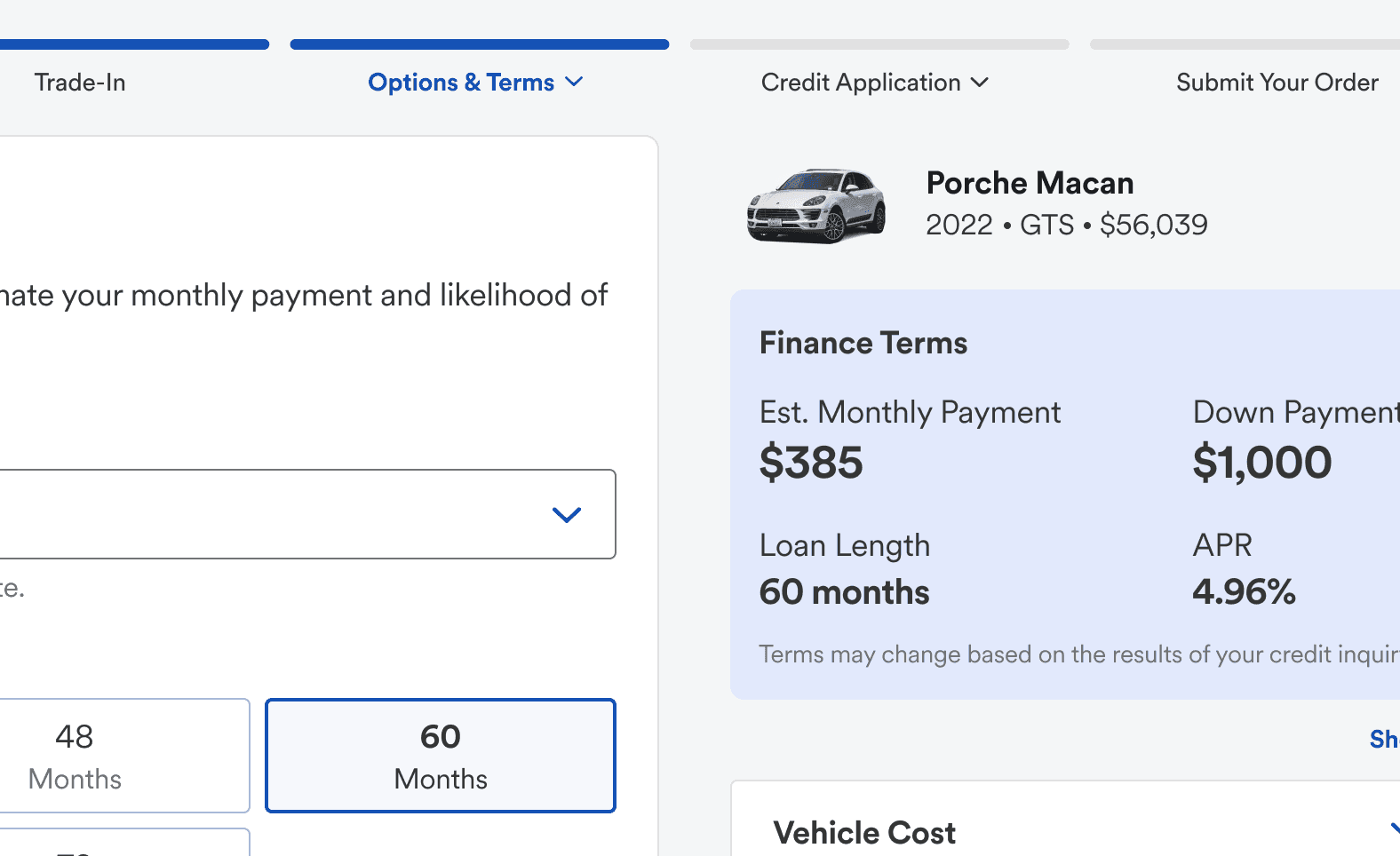
Price transparency
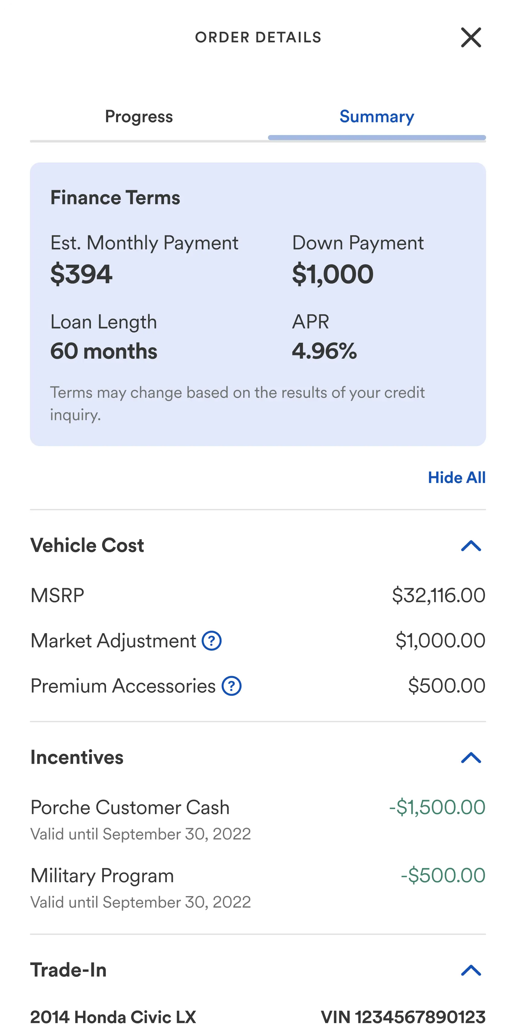
Improving price transparency throughout the experience was a top priority. When choices were made that impacted a customer’s total cost, monthly payment, APR, or overall affordability, those outcomes were clearly communicated within the UI. I ensured that estimated costs and finance information were visible on all screens throughout the experience, working with the team to identify the best mechanism to communicate the information clearly.
User experience improvements
Design, Product, and Engineering worked closely together to make the experiences more modular and connected. Previously, customers were required to input the same data in multiple locations. Checkout 2.0 eliminated the need for customers to input the same data more than once.
Small details big impact
With Checkout 2.0 I helped introduce a small yet impactful component to the design system — the outlined selector. Previously, the selectable options failed to reinforce the type of selection available. This improved the clarity of the UI and increased users' ability to traverse screens and make decisions.
I owe a great deal of my development as a designer to Derek. He leads by example in everything that he does, bringing a level of intentionality and thoughtfulness that is unmatched and infectious. In terms of moving the needle for the business, Derek led a team of designers on a massive redesign of the entire shopping experience for driveway, optimizing the core revenue driver of the product. Most importantly, Derek is a joy to work with. No ego, just high quality work and a genuine care for others and the product.

George Clingan
Experience Design Manager
Want to know more about this project?
I'd be happy to set up call where I can share more details about the project, challenges, constraints, and answer any questions you might have.
Driveway’s vehicle order experience struggled to keep up with the needs of the growing business and wasn’t meeting customer expectations. I was asked to lead the redesign of this flagship experience for the product.
Role
Principal Product Designer
Contributions
Concepts
Prototypes
Design
Strategy
Usability Testing
Role
Principal Designer
Contributions
Concepting
Prototyping
Design
Strategy
User Research
Usability Testing
Context
Driveway is a startup owned by Lithia Motors (NYSE: LAD), the largest new-car retailer in the US. I joined Driveway when they launched in October 2020 to help achieve their goal of redefining how consumers buy, sell, and finance vehicles 100% online. This is one of the many projects I worked on while focusing on the revenue and consumer web app experience team.
While this project was internally named Checkout 2.0, this is not your typical "1-2-3 checkout". Buying a vehicle online involves many facets. The flow needed to accommodate pre-owned and new cars, pre-qualification, financing, leasing, credit applications, denied credit, customer trade-ins, and scheduling for home delivery.
Over the span of 2 years, additional steps and features had been added piece meal and a wholistic evaluation of the checkout experience was overdue. While the current flow checked all of the boxes for technical requirements, it wasn't meeting business conversation goals or customer expectations. I was asked to concept and design a re-imagined and improved checkout experience.
Problems to Solve
1. Denied credit applicants would find out they couldn’t afford a vehicle too late in the flow. This resulted in a high number of orders starts, but low order completions.
2. Key affordability information was often obfuscated and it wasn't always clear how decisions affected total cost and affordability.
3. Users reported that it was unclear to them how the online car buying process worked and struggled to understand what was involved in the process.
4. Sad paths required human intervention and didn’t provide helpful alternative options and more affordable inventory for customers in need.
Solutions Explored
1. Affordability focused interactions were moved as close to the beginning of the flow as possible to provide customers with a better understanding of approval likelihood.
2. Decisions that affected terms and total costs were clearly communicated in the moment, and an improved and persistent total cost summary UI was added.
3. An improved system of navigation and wayfinding that helped customers understand the breadth of the flow and enabled them to traverse more easily.
4. Sad paths such as denied finance applications were paired with appropriate in-app optionality that helped customers find alternate vehicles they could afford.
TL;DR: Results
At the time of putting this case study together, Checkout 2.0 has not fully been rolled out into production. However, I can share some before-and-after attitudinal analysis and other measurable insights from usability testing.
Shorter Workflow: Reduced the total number of steps required to complete the flow and lessened the average total time to complete a vehicle order with approved financing.
Improved Navigation and Wayfinding: Usability subjects reported an 18% increase in attitudinal analysis with comparing the ease of navigation and completing the flow. Comparing current Checkout: 68% → Checkout 2.0: 86%
Improved Price Transparency and Customer Trust: Usability subjects reported a 23% increase in their ability to understand how their decisions affected finance terms and the total cost to finance as they moved through the flow. Subjects reported increased trust that prices were accurately represented through the process without any hidden fees.
Improved UX and Reduced Customer Errors: By incorporating Google/USPS auto-complete for address entry, Checkout 2.0 was able to almost entirely eliminate customer error when entering home address information. Which would decrease the time customer support agents spend working with customers to correct information.
A simplified example of re-prioritizing the finance estimator within the flow
One of the Challenges
While looking for ways to improve the customer experience and increase conversions, we focused on the finance estimator feature.
Our research uncovered a valuable insight: the sooner customers engaged with the finance estimator, the more likely they were to complete the flow with an approved loan.
Initially, the estimator was positioned towards the end of the process. This decision was influenced by the multitude of factors affecting the total finance amount, including trade-ins, additional care and protection plans, and incentives. The original intention was to enhance the accuracy of the estimator by positing all of the customer inputs that impacted the total finance amount before the estimator.
Upon closer examination of the data, we unearthed a pivotal revelation: the single most influential factor in determining affordability was trade-in credit. The other inputs had comparatively minor impacts on approval likelihood. As a result, we maintained the trade-in credit's position in the flow before calculating approval likelihood, while the remaining cost-related interactions were strategically re-prioritized and relocated later in the flow.
Navigation and wayfinding
When talking to customers one of the biggest complaints, was it was unclear to them what was involved, and what they would need to successfully complete their order. Customers wanted to know the exact steps, the information they needed, and to approximate how long the process would take. To solve this, I introduced an incremental linear stepper design pattern that addressed several customer complaints:
Communicating the specific steps in the vehicle order process
Utilized the Goal Gradient Effect and improved the communication to users on their progress within each step
Provided visibility into the sub steps of each section
Empowering customers to traverse the checkout experience as needed
Price transparency
Improving price transparency throughout the experience was a top priority. When choices were made that impacted a customer’s total cost, monthly payment, APR, or overall affordability, those outcomes were clearly communicated within the UI. I ensured that estimated costs and finance information were visible on all screens throughout the experience, working with the team to identify the best mechanism to communicate the information clearly.
User experience improvements
Design, Product, and Engineering worked closely together to make the experiences more modular and connected. Previously, customers were required to input the same data in multiple locations. Checkout 2.0 eliminated the need for customers to input the same data more than once.
Small details big impact
With Checkout 2.0 I helped introduce a small yet impactful component to the design system — the outlined selector. Previously, the selectable options failed to reinforce the type of selection available. This improved the clarity of the UI and increased users' ability to traverse screens and make decisions.
I owe a great deal of my development as a designer to Derek. He leads by example in everything that he does, bringing a level of intentionality and thoughtfulness that is unmatched and infectious. In terms of moving the needle for the business, Derek led a team of designers on a massive redesign of the entire shopping experience for driveway, optimizing the core revenue driver of the product. Most importantly, Derek is a joy to work with. No ego, just high quality work and a genuine care for others and the product.
George Clingan
Experience Design Manager
Want to know more about this project?
I'd be happy to set up call where I can share more details about the project, challenges, constraints, and answer any questions you might have.